So, what about this ad?

Ad analysis in 3 seconds – from a marketer’s eye
I met a friend after a long time and he had a challenge ready for me after we got the pleasantries out of our way. He showed me an ad and asked, what can you tell me about it? Not knowing anything about the ad, I looked at it for about 3 seconds and I was ready to dissect it. Some of you too must have seen it and may have an opinion but please stay with me as I analyze it at the face value. Again, I have no bonding with this ad or its designers nor am I against them. I am neutral.
So here’s the ad:
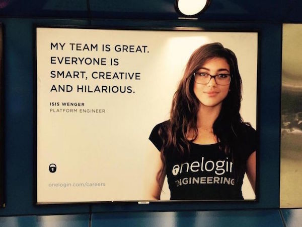
This is an awareness and a recruitment campaign. The target audience is junior and experienced potential and active job seekers. The targeted geo is North America and they have used an outdoor-display advertisement.
Now, the ad was made by a company and the person in the ad is a ‘real engineer’ and not some model. That, I came to know in the end.
We discussed my review of this ad over dinner and I thought of sharing it here.
1. Ok, what’s the name of the company?
The first thing that caught my attention (or did not) was the name of the company the ad was made for. Clear brand name and emblem is a must for an ad to instil relevance in the minds of its readers and create a recall value. All I could see was a lock and a URL to the careers page (irrelevant, as this is a print ad). Even though the person in the pic is wearing merchandise, the name is not completely visible.
Fix: Where there is an emblem in the ad (baseline), add the name of the company too (not needed if you are a household name like Microsoft or BMW).
2. Next, the content…
Honestly, I chuckled when I read the headline / slogan. “My team is great.” is good. “Everyone…” makes it tasteless. It is as if you were able to hire the best talent across the globe. From an investor’s perspective, one would like to question how it was possible. With such a small footprint, how were you able to only hire engineers / marketers who were smart and creative at the same time being hilarious? Often, smart and creative people are the silent sort. Just saying.
Fix: “I love my team. We are creative and fun to work with.” Simple, but does the job. Could be made better though.
3. What’s in a name, but there is…
With due respect, ISIS WENGER may be a name of a real person (and in this case it is), but given the world we live in today, it’s a bit uncomforting using it in an ad. Sensitivity to the time we live in is critical to the ad world. Also, with the socio-political conditions that exist, it’s best to avoid reference to negative associations. And I am not referring to the last name.
Fix: Use names that resonate with your target audience. I am sure there are people working in your company who are natives. Blend them in.
4. The model, oops engineer
Lastly, let’s be honest, the person depicted in the imagery is not an ideal description of an engineer. Don’t get me wrong. I have nothing against good-looking people or engineers or both. But normally an engineer has to work really hard to complete gruelling 4 years of technical education. By the end of the 8th semester, they don’t really care so much about their looks as much as their job and a career. And the smirk is not helping either.
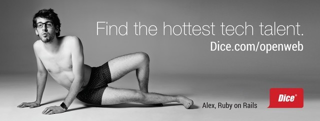
But if you should want to break a stereotype, look at the ad below by Dice. This is a perfect example of how you can blend humour with your ad.
Fix: To draw your audience’s attention, try using a model / real engineer that looks similar to most who would show up for an interview.
The ad I assessed above created a lot of backlash on social media and the engineer, Isis, had to set-up another campaign to defend this idea. An ad that is built to break stereotype should have its roots somewhere deep within the content or it’s pre-release. Abruptly changing the course of a thought process, psychologically, will not tie the message in. In most cases, it will compel the viewers to get around it as quickly as they can.
The positive outcome of this campaign was that it created quite a bit of awareness (and stir). It certainly put the brand ‘out there’. The much-needed attention it brought to the company that it was hiring engineers, must have generated traffic for its website.
On the topic of breaking stereotypes, in the past, a few adverts have brilliantly broken clichés.
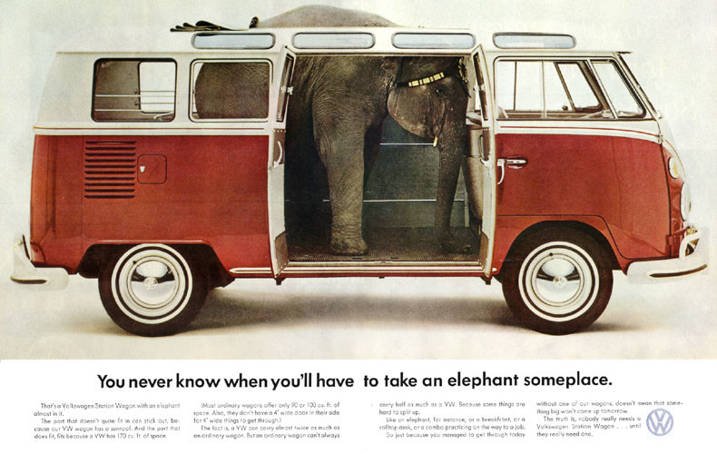
Speaking of Volkswagen, there have been countless ads that have brought out the best creatives in the entire history of advertisement. A big thumbs-up to DDB for their inspiring VW ads during the 1950s & ’60s.
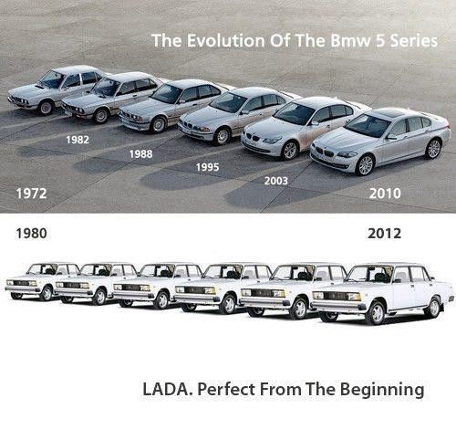
Below is an ad from the infamous LADA, a car manufacturer from Russia. Consistency at its best. Goes a long way to say; you don’t need big money to create a smart advert.
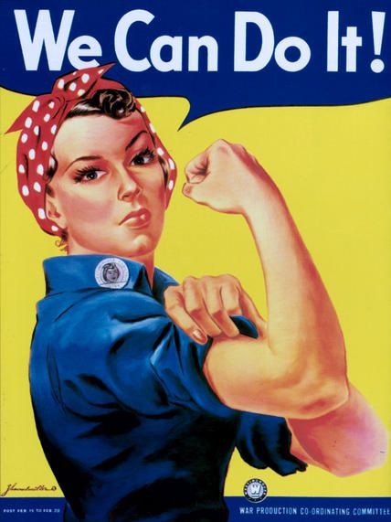
This is a well-known, iconic American wartime propaganda poster created to motivate workers during WWII. It propagated feminism and other socio-political issues during the ’80s.
Fundamental flaws in an ad can easily be avoided if the start is right. And start you will with market research.
Here’s what Ogilvy has to say:

I think marketers need to understand their customer’s mindset, use appropriate judgement and time their ads well. Especially, if the ad is meant for mass consumption and not targeted using direct messaging. What do you think?
Please write to me.